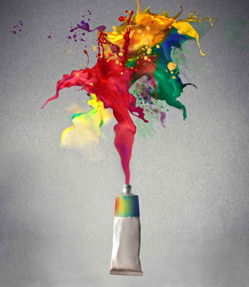
You own your business and it’s important to you to have it grow, flourish, and be successful. We don’t know of a single business owner who doesn’t feel this way. To help ensure that your business is profitable, you need to properly promote and sell your product. Now ask yourself this: what is the first thing consumers will see when they look at your company or product? The first thing that comes to our mind is your logo. A logo can help define a company and create a brand love and loyalty, which will resonate with your customer base for years on end.
There are many different design aspects that go into developing a great logo for your company. One of the biggest things to think about, one that is often overlooked, is the color scheme you want to use for your logo. Over years of marketing and designing logos, we’ve seen many companies who have chosen a logo color without putting much thought into what that color says to target audiences. There is a reason why there’s a color trend in different industries. For example, when you look at the eye products section at the supermarket, you’d be hard pressed to see any that are packaged in red. This is because when we think of our eyes, we think sensitive. When we see the color red, we think irritation, or powerful and strong, but when it comes to our eyes, we want soothing and calm. This is why most eye products are packaged in blues and greens.
There have been many interesting studies on the psychology of color. Different colors evoke different feelings in people. Considering your target consumer base when creating your business logo will help your company or product to resonate better with them. Let’s take a look at some colors and the feelings and concepts they inspire in us:
Red: Active, Power, Alarm, Strength, Hunger, Love, Passion
Yellow: Energy, Cheer, Optimism, Excitement, Youth, Caution, Friendliness
Orange: Health, Attraction, Happiness, Creativity, Innovation
Green: Natural, Soothing, Balance, Money, Growth, Healing, Fresh, New
Blue: Calm, Peace, Sincerity, Affection, Stability, Trust, Confidence
Purple: Wealth, Royalty, Dignity, Prestige, Wisdom, Sophistication
Pink: Tenderness, Caring, Love, Thoughtful, Sweet
Black: Authority, Classic, Mystery, Elegance, Bold, Formality
White: Clean, Pure, Innocent, Hope, Simplicity, Honesty
Gray: Traditional, Conservative, Reliable, Neutral
Brown: Outdoors, Longevity, Wholesome, Organic, Comfort
Knowing the expected reaction to different colors, and properly applying them to your business and its logo, will help to bring out the right emotions in consumers, silently urging them to want to do business with you. We found an amazing infographic that helps to further explain what we’re talking about. Designed by Kate Taylor, an Entrepreneur staff writer, we urge you to check it out: http://www.entrepreneur.com/article/232401