Frontpoint Health Brand Identity
People First
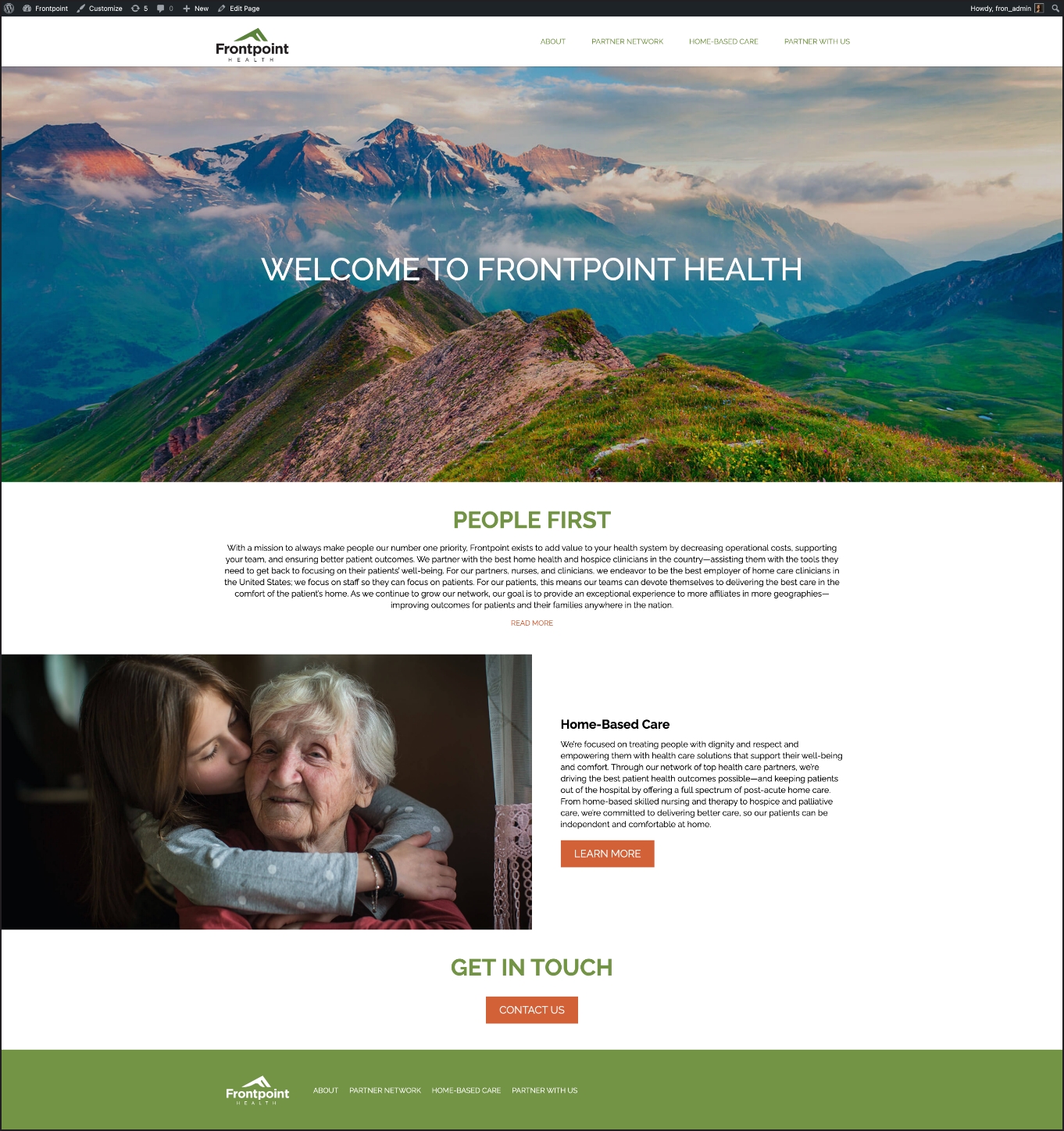
Frontpoint’s mission is to provide home health and hospice care providers with the tools they need to give their patients the highest quality care. They wanted their messaging to convey respect for the people they serve, so we developed a professional logo and user-friendly website with a warm and inviting tone.
Leaving a Mark
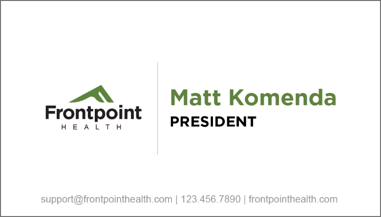
A company with a strong mission needs a strong logo. The F-shaped mountain feels like the perfect visual representation of an organization that provides support and strength to its patients.

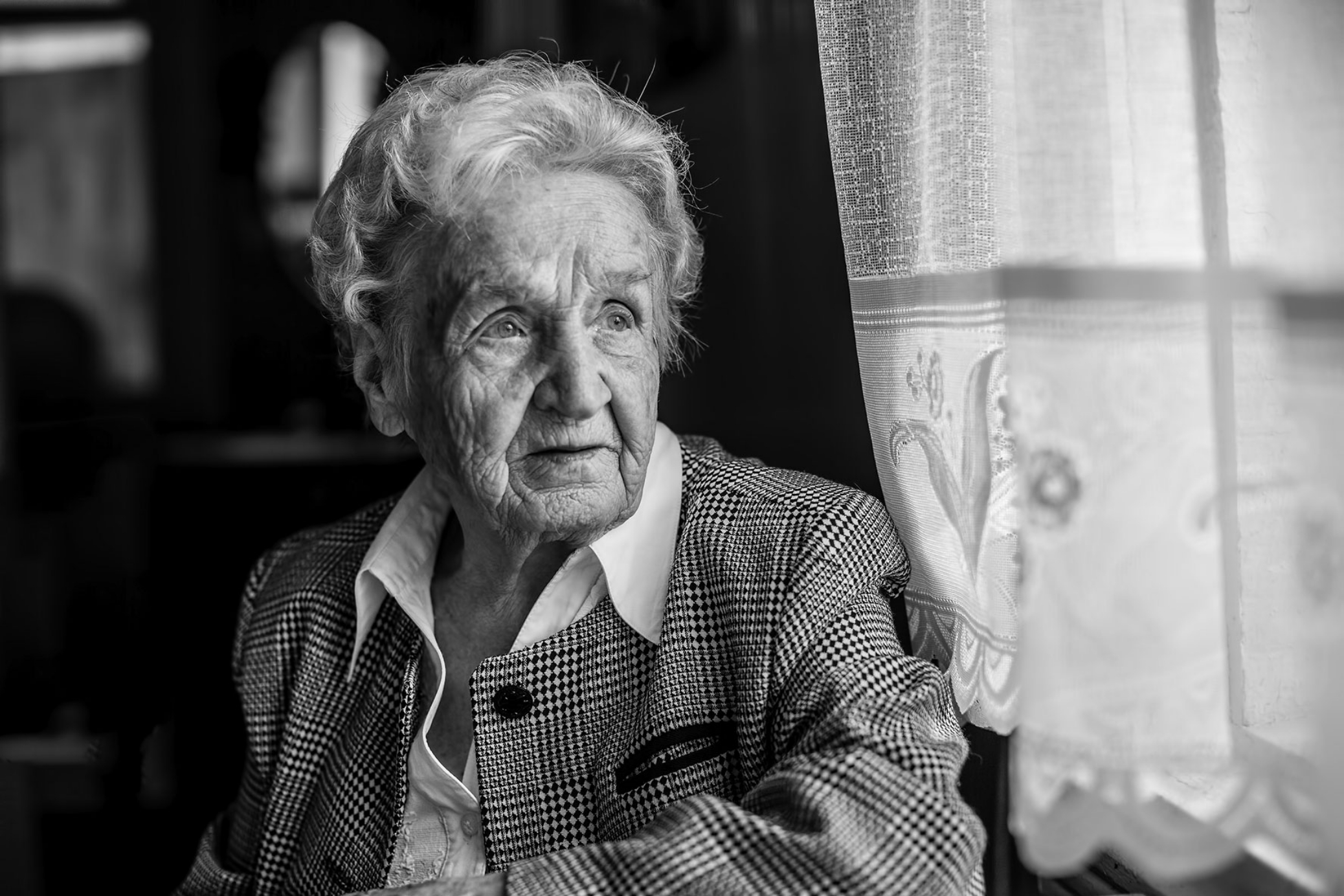
A Touch of Humanity
We carefully selected a series of images containing real people in natural poses that highlight the human experience, a central piece of Frontpoint’s messaging.
Caring with Color
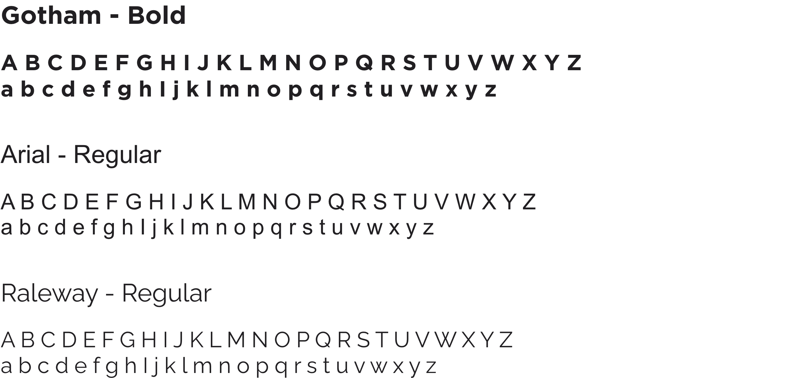
We selected a solid green color to give this brand a healthy, clean feel. The secondary colors we chose helped to complement and ground the identity. Bold, clean fonts give Frontpoint a fresh and modern look, and help express the brand’s message in a clear and visually-appealing way.
Primary Palette

Secondary Palette

Tertiary Palette


Inform and Inspire
To help share Frontpoint’s mission of putting people first, we created an easily accessible website that contains thoughtful messaging in a professional, personal, and informative tone.