Twenty & Creek Brand Identity

Where Finesse Meets Function
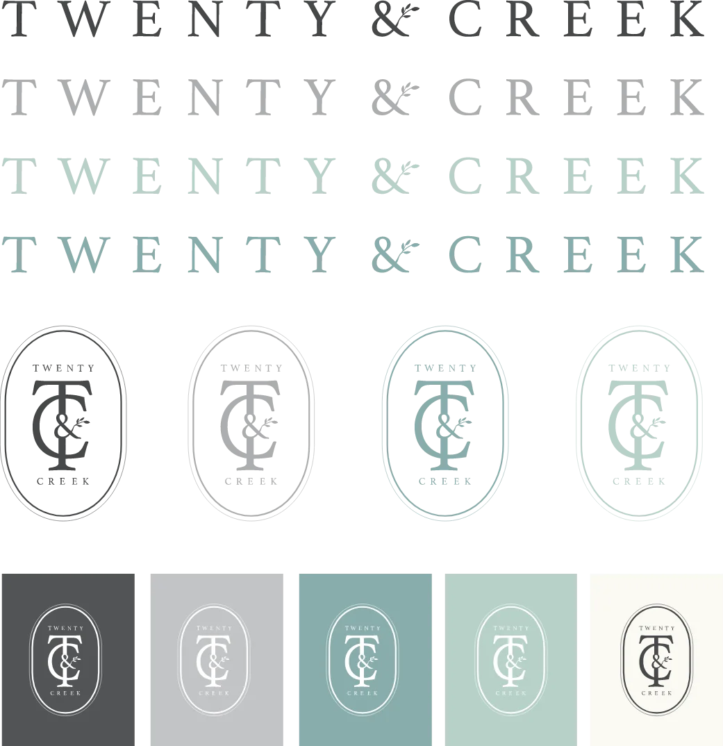
Twenty & Creek came to us with a venue and a vision. From there, we developed a name and a logo designed to look strong across multiple use cases. Because their space is built to host a variety of different events, their identity needed to be classic and clean, while avoiding leaning too heavily on the bridal aspect.

Just Their Type
The site’s typefaces were chosen with both style and legibility in mind. We loved the eye-catching accent font, La Bohemienne, and paired it with Baskerville, a title and header font that is both classic and clear. Our secondary font choice, Proxima Nova, was selected for its easy-to-read quality.
Beyond Wedding White
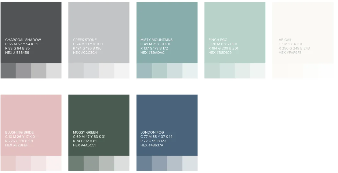
Twenty & Creek is a venue built for any event. We kept this versatility in mind when developing its color palette. Our primary and secondary palettes were developed to be neutral and versatile, while also maintaining traditional bridal colors.
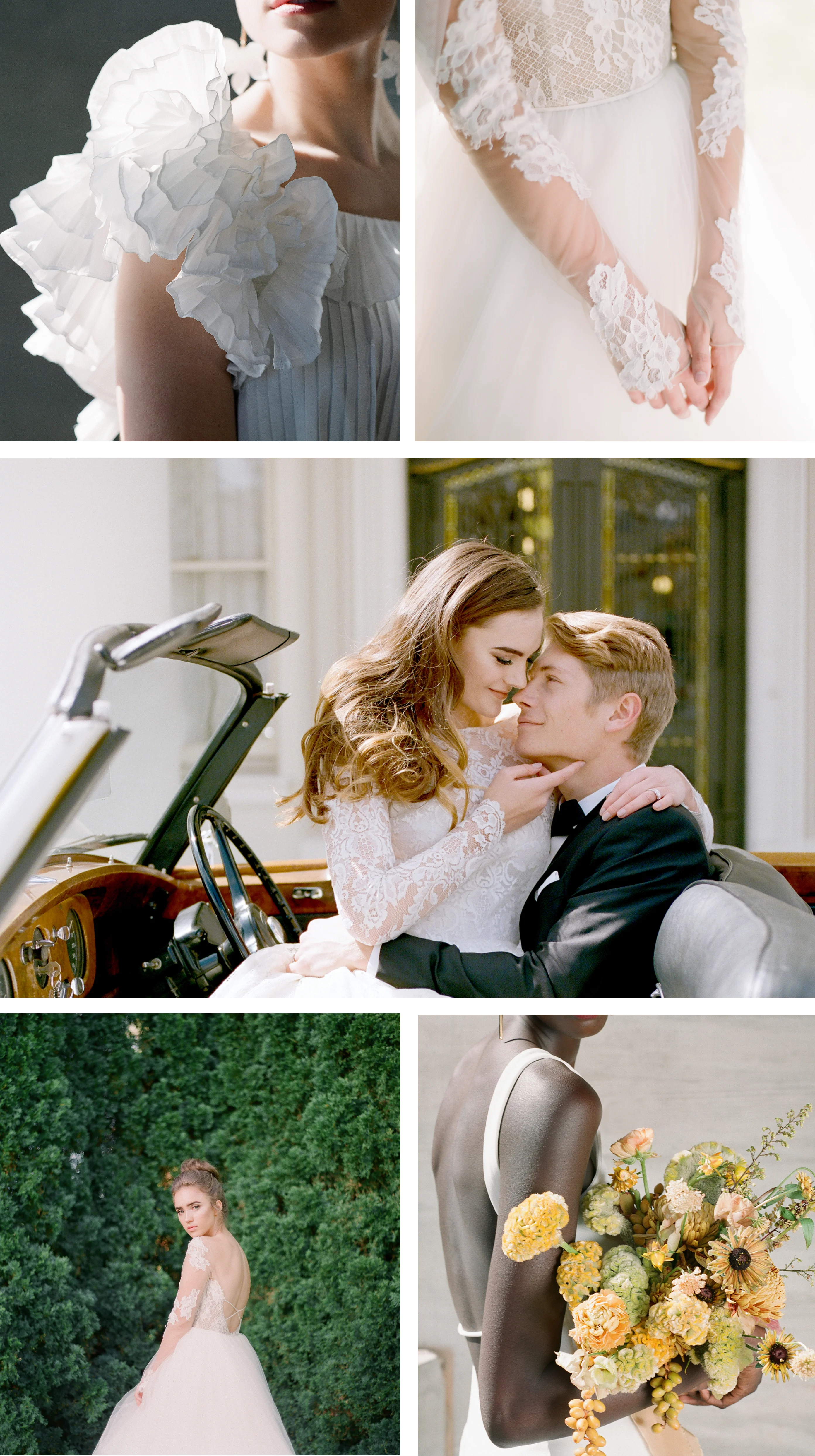
Picture Perfect
We chose photography that matched the bright, airy essence of the space; vibrant photographs that highlight hand-crafted details to parallel Twenty & Creek’s design intention.