Twenty & Creek Web Design
A Sight To Be Seen
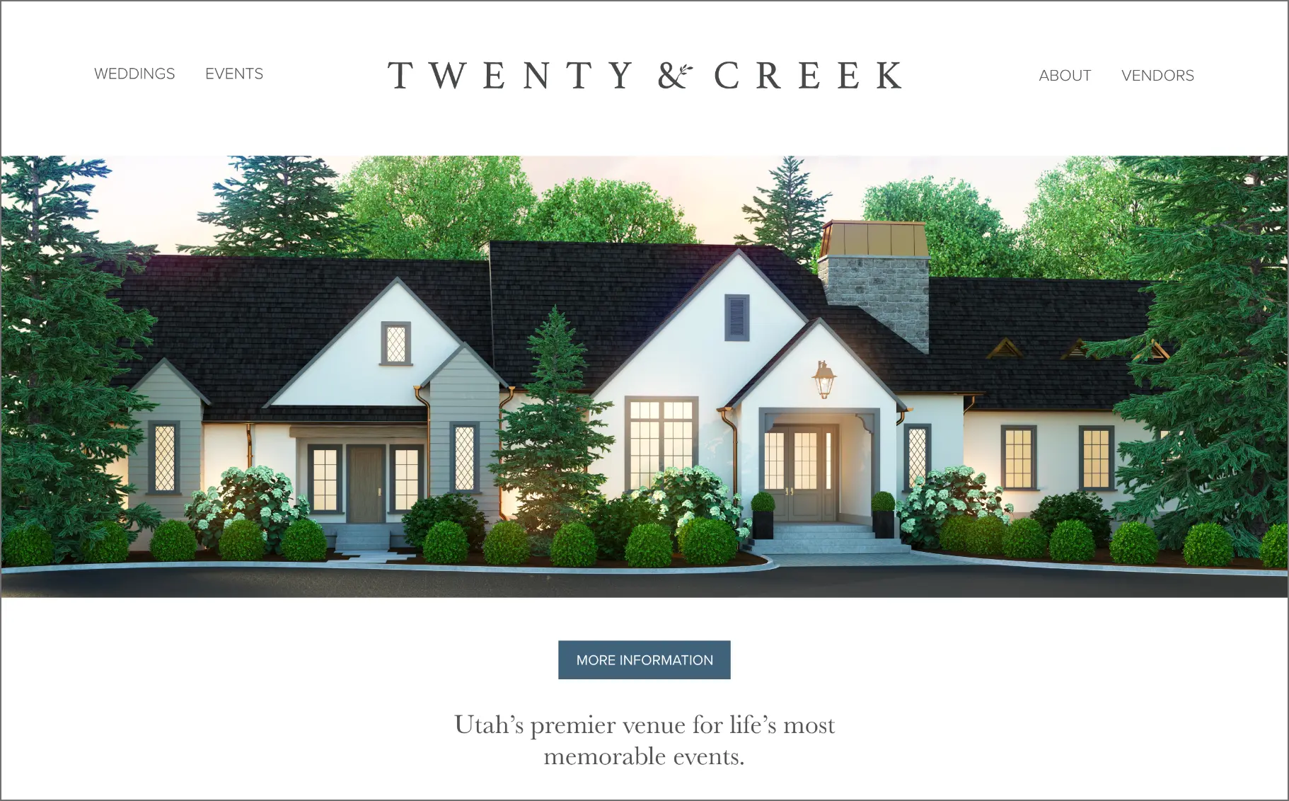
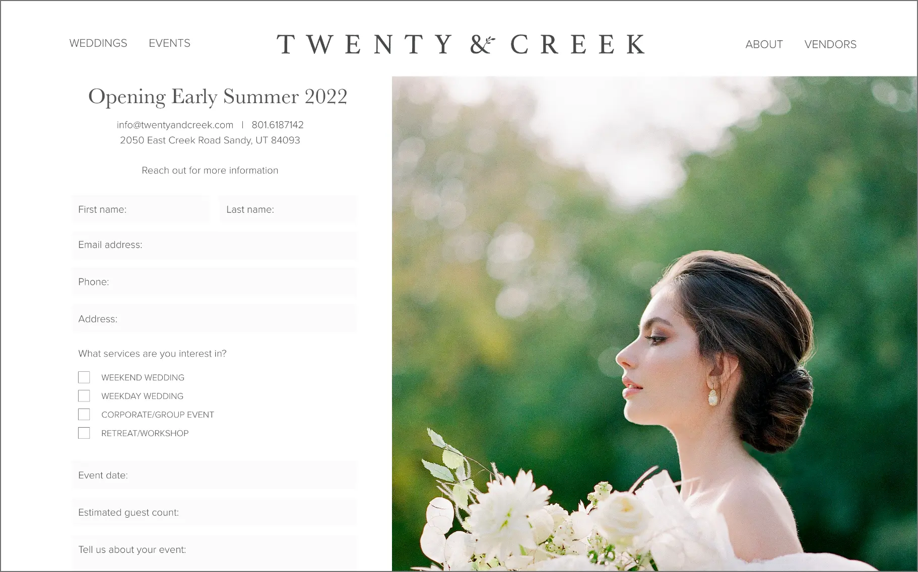
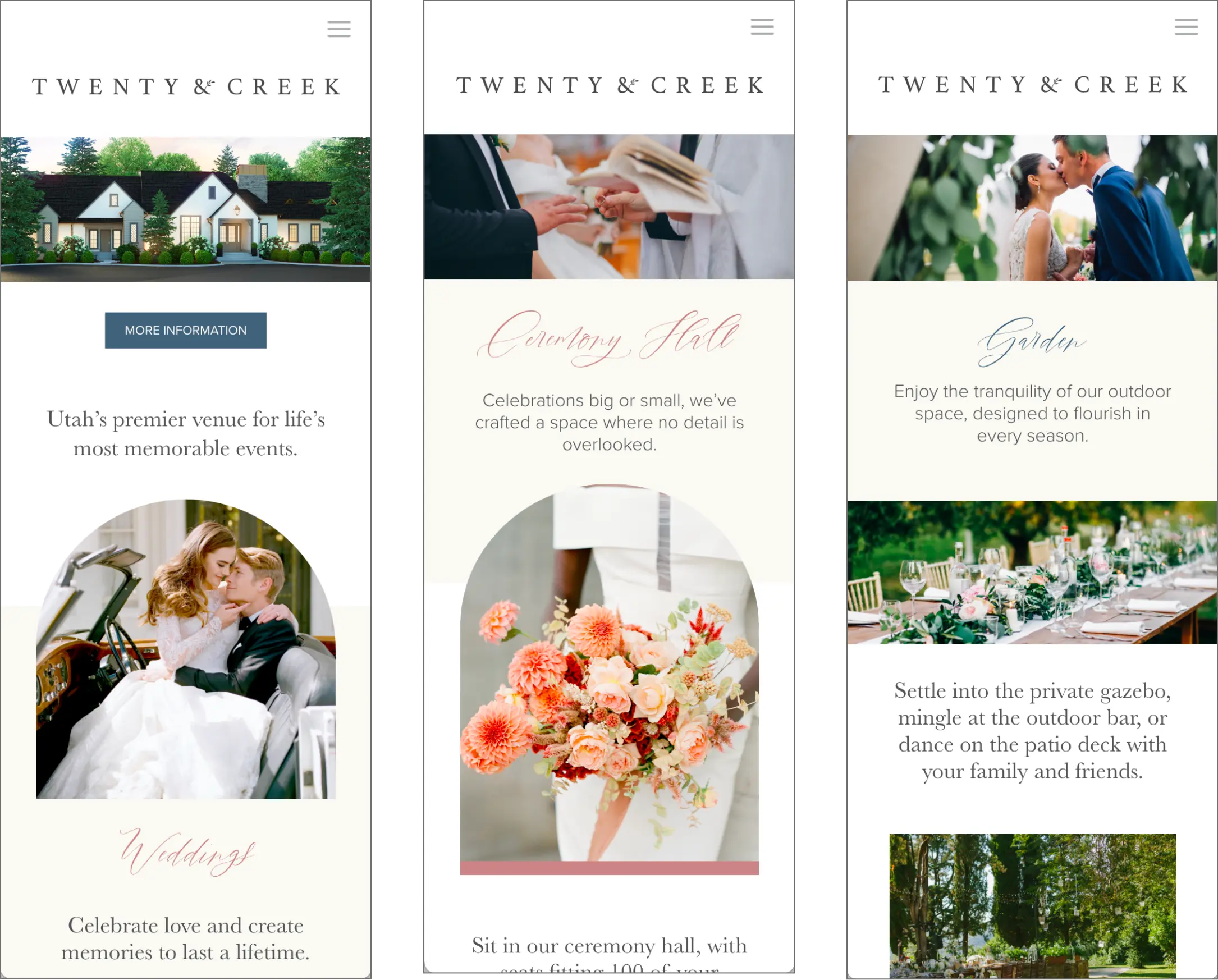
A setting as gorgeous as Twenty & Creek sells itself, that’s why we developed their website with the venue being the primary focal point. Our picture-centered layout shows off all the meticulously designed rooms and spaces, both inside and out.


It’s All in the Details
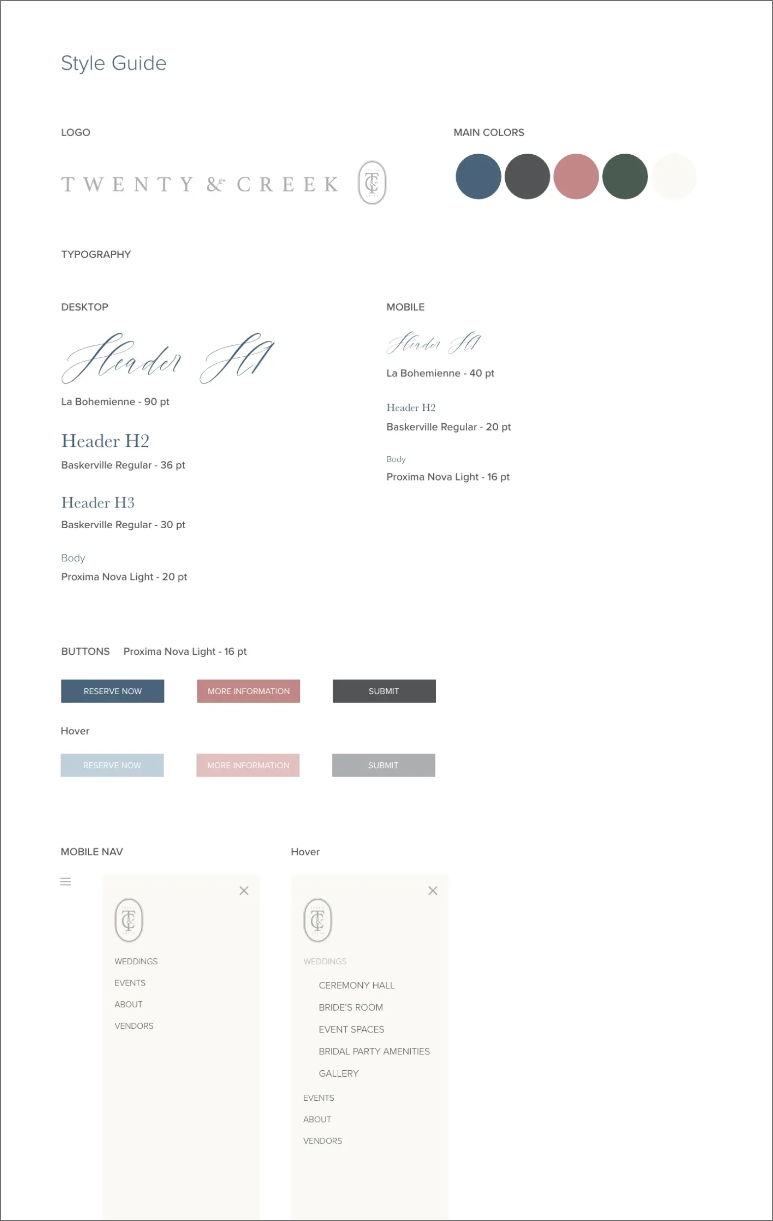
From the classically designed logo and the modern bridal palette, to the delicate script headers and the strong secondary font, our style guide captures the essence of their brand while creating something unique and beautiful.


